Tuesday, August 25, 2009
Back Soon

Friday, August 07, 2009
Red & Black

So I started with a red piece of cardstock, I stamped the image lower left-hand image from Bo Bunny in Versamark and then embossed with clear embossing powder. I then shadow stamped the same image with Worn Lipstick and then embossed again. I then grabbed my trusty sponges and layered on the Worn Lipstick, then Fired Brick and then I layered on the Black Soot.
My next step was to stamp the large wroth iron image over the red stamp and inks. The large image is from Fancy Pants, it is strange because it matches the Bo Bunny image but is a size up. Next I stamped the silver image in the top right-hand corner with Versamark and then embossed with Zing! embossing powder in Platinum.
I cut out the red circle with my Revolution and Spellbinder die. I stamped the circle with the background stamp from Stampin' Up called French Script. I used Fired Brick Distress Ink and I did the same with the bellyband. I then rubbed the edge with Fired Brick and Black Soot Inks. The "M" was cut using the QK Revolution and it from the Magnolia alphabet set. I pressed it into a Versamark pad and then embossed with the Zing! Platinum. I added the red ribbon from Stampin' Up and then layered onto a charcoal accent papers.


Thursday, August 06, 2009
'Ello Govna'
 Can you tell that I am in a distressing mode?? To begin I started with a blank white card. I sponged on Antique Linen, Tea Dye, and Vintage Photo Distress Inks, then I added a very little touch of Walnut Stain on the very edge. The awesome bulldog is from Inkadinkado. I stamped him with Jet Black Archival Ink, added a few touches of colour with my Stampin' Up markers, cut him out and then aged him in the same manner as the background. I then mounted him on a piece of black cardstock and cut that out.
Now to the Union Jack, I cut the flag out using my Quickutz Silhouette Craft Cutter it was cut from white cardstock. It was in three layers. I sponged on the background piece with Broken China Distress Ink and then worked in Faded Jeans. Next I worked on the top layer, starting with Worn Lipstick and then Fired Brick Distress Ink. I worked Antique Linen on the light part of the flag. I then assembled my flag, and then aged it following the same process I used on the background of the card. My last step was to mount this to my black cardstock. I stamped the sentiment in Walnut and that was it. This was pretty quick and easy and I think that this bulldog rocks. Have a great night all!
Monday, August 03, 2009
Fairy Card

 The pattern paper is from Making Memories, the flowers are Prima and the solid cardstock is all from Stampin' Up. The Flutter sentiment is from Making Memories. I used my Stickles all over my flowers and on the wings.
Here is a list of the Copic markers I used.
Hair
B32
B21
B24
Face
E00
E02
Cloths
BG10
BG13
BV00
BV04
V01
V04
V09
Thank you for stopping by!
Friday, July 31, 2009
Friday Cards

This card is created with brown and lime green cardstock, I purchased both at Archivers and they are the Archivers brand.
I used the Handful of Henna stamp set from Technique Tuesday. I stamped each piece with Basic Brown ink from Stampin' Up and embossed with clear embossing powder. I then went back and shadow stamped each design with Sahara Sand ink to give a little more depth. I went back in and accented the design with a white, lime green and blue gel pens. It is key to let the gel pens dry before moving on to the next step. I then aged the lime green cardstock with the Basic Brown ink.
Next, I cut the bands in brown and lime green and edged the lime green piece with the EK Success punch Moroccan Lace. I aged the lime green with the Basic Brown ink. I tied around the strips with Organza Ribbon in Brown from Stampin' Up. My final accent for this card was the little gems, they are from Hero Arts.

 Surprise! More Damask!
To begin, I started with a piece of white cardstock, I sponged on Broken China and Faded Jeans Distress Ink from Ranger. Once the ink dried, I stamped using the Antique Damask stamp from Memory Box with Versmark and then I embossed using Gold Zing! Embossing Powder. This embossing powder is great, very opaque and easy to use.
The background and bellyband papers are Brushed Gold cardstock from Stampin' Up. The off-white band was painted using Antique Linen Distress Crackle Paint from Ranger. Once it was dry I sponged over the painted strip with Tattered Rose and Tea Dye Distress Ink. The small medallion was created by cutting out two circles. The blue one was sponged with Broken China and Faded Jeans Distress Inks. I then edged it with a gold paint pen. The gold piece was created by repeatedly embossing the small circle with Gold Zing! powder. On my third embossing pass pressed a stamp from Papertrey's Guidelines Two set in the hot embossing powder. My three brads are custom colored by dipping each brad into the Gold Zing! powder and heating. My last step was stamping the sentiment from Stampin' Up in Faded Jeans.
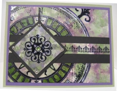

I am really loving the Alcohol Inks from Ranger, you can create a lot of different looks. I started with a base of glossy white cardstock from Stampin' Up. I sponged on alcohol ink in Eggplant and Meadow, once I had a base layer on I added the Blending Solution and Pearl Mixative on my felt and sponged again. Once dry, I stamped the Compass Rose image, it is from Tattered Angels and is called Tattered Traveler Compass. I used Black Archival Ink from Ranger. I dryed it with my heat gun to set the ink. Next, I poured a little of each color of the alcohol ink onto my craft mat. I only put a little ink on my sheet at a time, as it dries very fast. I then painted with the ink using the Eggplant and Meadow and Silver Mixative.
I had cut a little of the initial cardstock off and used that as my bellyband. I stamped on the bellyband using an image from Technique Tuesday from the Bijou Borders set using Black Archival Ink. I then cut my small square and performed the same inking technique as I mentioned above. Once dry I stamped the central image from the American Crafts set Majestic. I then embossed with clear embossing powder. I added the silver brads and mounted to black cardstock. Once assembled I mounted the base to Eggplant Envy cardstock and then to Sage Shadow cardstock.
Sunday, July 26, 2009
Alcohol Ink Cards


For the primary image I began with a square of white glossy cardstock. I used my applicator tool and loaded my felt with Cranberry and Butterscotch and Blending Solution. I covered the whole square and once that was dry I added Copper Mixative to my felt and pounced over the existing colors.
I loaded my stamp, Tapestry Pattern from Stampabilities, with Versamark Ink and stamped on the square. I quickly poured Ranger Distressed Embossing Powder in Black Soot over the image and heat set. Once cool I rubbed off the release crystals. I think that I would have gotten a better result if I had remembered to shake the embossing powder before I used it. Since I don't have a copper paint marker to do the edges, I used my Versamark pen and Copper Embossing Powder. I simply ran the Versamark pen down the edge and the sprinkled that with Copper Zing! Embossing Powder, then heat set it.


This purple card was made using Wild Plum, Stream and Eggplant Alcohol Ink and Pearl Mixative. For this one I started with the Wild Plum on the left-hand side and then started with the Stream and Eggplant on the right-hand side. I then added the Blending Solution and the Pearl Mixative to my little felt piece and and pounced over the whole card. This is what blended the two sides of the card.
The stamp on this card is from a new set I picked up this week called Formal Esque by Recollections. This set is very elegant and I see myself using it a lot. For this card I used the main image and loaded it with Archival Ink in Jet Black. I would have normally gone with Stazon but I thought that I would try this ink. I was really happy with how it worked on the glossy cardstock. Since it takes awhile for the ink to dry I hit the piece with my heat gun. If I don't do that I run the risk of smudging it and ruining all of my hard work. My last step was adding the little dots with Liquid Pearls in White Opal. I also added just a few little dots of Stickles in Frosted Lace. Added a black piece of cardstock and a black organza ribbon from Stampin' Up.

 For the background of this card I started with glossy white cardstock, again. I loaded up my felt piece with Meadow, Currant, and Slate Alcohol Inks and added a little Pearl Mixative and then Blending Solution. I kept the application a little lighter on this card just for a different look. I normally go for intense colors so I sometimes make myself back off a little. I then stamped the background images with a great new stamp from American Crafts. It is from their Majestic Set. I used the Archival Ink in Jet Black and then embossed it with Black Embossing Powder from Stampin' Up. I actually stamped the whole background and then decided to emboss the images. I guess that is a benefit of working on glossy cardstock.
For the central image I selected another image from the Majestic Set and stamped with Archival Ink in Jet Black and embossed with Silver Embossing Powder from Stampin' Up. I mounted the black piece of cardstock to a piece of silver cardstock, both from Stampin' Up. I selected a smooth gem from Hero Arts and colored it with the Currant Alcohol Ink. I adhered the image to the background with pop dots and added a black organza ribbon from Stampin' Up.
Thanks for stopping by there will be more soon!!
Sunday, July 12, 2009
Inspired by Berry Sensation


The stamps are from The Paper Studio by Stampabilities and are in the Flourish Set. The stamping on the bright green is Basic Brown and the stamping on the berry was done in Versamark. The edging on the brown was done with an EK Success border punch called Scallop Diamond. The organza ribbon is from Creative Impressions and the gems are from K&CO. This is a very simple card but I think that the colors are pretty unique.
Rock Star - girly style!

As in my previous card Yellow Damask, this card has been floating around in my head for awhile. The background is Regal Rose stamped with the Zebra Background stamp by Stampabilities in Basic Black Craft ink and embossed with Black Embossing Powder. I ran a silver metallic pen around the very edge.
Next, I cut a piece of Berry Sensation by Brazzil. I stamped the skull border with Basic Black ink and embossed with clear embossing powder. This stamp is from Inkadinkado's Rock Star Set. I colored in the accents with a pink and silver gel pens from Gel Writer. Next, I cut out an oval and embossed it with Zing! Black Glitter powder. I layered onto that the skull rock & roll image that I stamped with Rose Red and Basic Black inks. I threw on the awesome pink metallic brads. I placed that onto a strip of Regal Rose cardstock that I set six very, very small eyelets. I was going for a rock star belt look. I stamped the top of the card with swirls in Versmark from a set called In My Dreams from Ink by Steph for Fiskars.
I cut out the words from White cardstock using my QuicKutz Silhouette Cutter using a font called Jailbird Jenna. I inked it with Worn Lipstick Distress Ink by Ranger and then Rose Red. I then embossed two coats of Iridescent Ice Embossing Powder and then two coats of UTEE. I cut the shadow in Basic Black using my Silhouette. The star is from a sticker set from EK Success, it was brown which totally wasn't working for my card so I inked it with Black Stazon.
Here is a close-up of the detail on the STAR and star.

Soleil & Damask

This card was inspired by the Thinking Inking series. I began this card by cutting out the sun using my QuicKutz Silhouette Digital Craft Cutter. I used Basic Black cardstock form SU! Once I had that cut, I started coloring my sun with Adirondack Paint Dabbers in Gold and Copper, dabbing directly onto the cardstock. I then took my makeup sponge and moved the paint round until I had the effect I was looking for, in this case I wanted it slightly blended. I made sure to leave some places where you could see the cardstock through the paint, I let this air dry. Once the die was dry I rubbed Versamark Ink onto the sun and embossed with Ultra Thick Embossing Enamel, I let it cool and then repeated this process two additional times. You can see the effect in the lower image. In person this is a really neat look.

To create the background I started with a White piece of cardstock, I worked the following Ranger Distress Inks onto the cardstock; Antique Linen, Tea Dye, Vintage Photo, and Walnut Stain. I use a Stampin' Up sponge cut into quarters and my craft sheet to get a smooth effect. I then stamped over the background with the French Script background stamp from Stampin' Up using Tea Dye. Once I ink up my stamp I take a baby wipe and take off some of the ink to give a bit more distress. I kept the negative image from when I cut out my sun and used this as a mask, I sponged with Frayed Burlap onto the background. The edge of the card was detailed with a Marvy Opaque Paint Marker in Gold. The brads are from embossed with Pirate Gold embossing powder from StampN Stuff. To finish off the card I distressed the edges of the main background and mounted it onto a piece of black cradstock.
Our next card today is one that has been floating around in my head for awhile. I am again really happy with how it turned out.


I started with a quarter-sheet for Summer Sun cardstock from Stampin' Up. I know that I have mentioned that I normally eschew working with black embossing powder, it just gets so sticky and gets everywhere!! In an attempt to work though my Black EP issues I have been making myself work with it. The image in the background is from Heidi Swapp. I inked it with Basic Black Craft ink and then embossed with the dreaded Black Embossing Powder, first making sure that was vigilant in my application of my Emboss Buddy. I shadow stamped the same image with Sahara Sand ink from SU. My next step was to add the shading, I made sure to work the color on the edges and over the damask images themselves. I started with Summer Sun and then moved into Marigold Morning, More Mustard and Basic Brown (all from Stampin' Up). I really kept the brown just on the edges. Once my ink set I did a little embellishing with Yellow and Clear Stickles. The ribbon is the black grosgrain ribbon from Stampin' Up. The Sentiment is from My Sentiments Exactly, stamped with Basic Black ink and Black EP. The flowers are from Prima Marketing and the centers are black gems from Hero Arts.
I have two more cards that I am going to get up a little later tonight. Thanks for stopping by.
Tuesday, July 07, 2009
Distressed Cards

I have been following the Jennifer McGuire Thinking Inking series over at Two Peas in a Bucket for the last few weeks. These are really neat tutorials and very inspiring. I highly recommend that you check it out. I made this card after watching the series on Ranger Paint Dabbers.
I began with a white piece of cardstock. I stamped the images that appear as white with Versamark and embossed with clear embossing powder. The stamp is from the Flourish set from BoBunny. For the next step I pounced paint onto the card with Gold and Copper paint and then swirled it together using a makeup sponge. I used one of those little wedge ones, it seemed to work very well. Then I let the paint dry, Au natural no heat gun assistance. Then I took a damp paper towel and scrubbed the paint off of the flourishes. I did this same process for the sentiment.
The branch shape is from Quickutz, I cut it out of brown cardstock. I removed an extra bird off another branch and then put gold paint onto it. This I blasted with the heat gun to get the paint to bubble up. Everything was mounted to brown cardstock and voila - all done.


For this card I used my Papertrey Damask set - which I adore, I am sure that you hadn't noticed how often I have been using it. I started with Vanilla cardstock and stamped with Versamark and embossed my damask with Distress Embossing Powder by Ranger in Black Soot. Once the EP sets you go back and rub the release crystals off. Next I aged my back ground with Tea Dye, Walnut Stain and Black Soot Distress Inks by Ranger, between the Tea and Walnut I added Close to Cocoa. Since I did this after I did the embossing powder my sponge was a little worse for wear because the embossing powder is quite ruff. I did this same process to my sentiment block but I used black ink and clear embossing powder, I thought that using the Distress Embossing Powder would make it hard to read.
The brads started as gold brads and I inked them with Versamark and then into black embossing powder twice and then into Ultra Thick Embossing Enamel once. I am really irritated at myself for not getting them straight on the card, but such is life. The metallic paper is by The Paper Co and is called Gilded Rust. I added the black cardstock and then to a Vanilla cardstock base.

This last card today was also created with Distress Inks but I think it has a very different look. I started with a white piece of cardstock and inked my image, from Inkadinkado's Garden Flower set, with Peeled Paint and Worn Lipstick Distress Inks from Ranger. I then spritzed the stamp with water a few times and then stamped. For the edging I swiped my two ink pads on my craft sheet then spritzed with water again and then swirled my paper through the puddles of color, only getting the color on the edges. I added a celery ribbon and attached it to a coral piece of cardstock. Very simple easy card.
Monday, July 06, 2009
Cards Galore
 This was a very easy card. All of the shapes were cut out using my Silhouette Digital Cutter. The font is Mandingo. Very easy, but fun!

 I am loving all of the distressed techniques that are popular now. I cut out the emblem shape with my Quickutz Revolution. I stamped the image from Colorado StampN' with True Black Palette ink and then embossed with clear embossing powder. I watercolored the image using Twinkle H20s in Yellow Rose, Stargazer, Black Orchid and Key Lime. The Lions were watercolored with Stampin' Up Classic ink in Close to Cocoa. I aged the image with Antique Linen, Vintage Photo and Aged Mahogany Distress Inks from Ranger. The outer frame was embossed with Zing! powder in Chestnut.
The brads started as simple gold brads that I embossed with Zing! powder in Chestnut twice, and then I embossed with Ultra Thick Embossing Enamel. The effect was that the embossing powders created a marbled effect.
On the background, I started with White Cardstock. I sponged on Antique Linen, Vintage Photo and then Aged Mahogany on the very edges. I stamped the corner piece from Regal Flourish by Tim Holtz for Stampers Anonymous and Antique Map Background from Hero Arts in Vintage Photo. I then stamped London from Wordswoth in Vintage Photo and Aged Mahogany. Once I had everything the way I wanted it I spritzed it with water. My final step was to mount the whole thing to a burgundy piece of cardstock and add an organza ribbon from Creative Impressions. Now it took a long time to complete this card but I am really happy how it turned out. I'd like to believe that some of the time was due to the trial and error process.
As you might have noticed, I have been distressing lots of project, so in an effort to do something different I created this card.

The little girl is from Basic Grey and was stamped with Palette True Black and embossed with clear embossing powder. I colored her with my Copic markers. The "Hi" is from the Chic Alpha Set by Fancy Pants. The blue background was embossed with a Cuttlebug embossing folder. I created another custom brad for this card. I started with a silver brad, embossed in blue glitter embossing powder from Zing!, I did this twice and then into the UTEE powder twice. You can see the detail below. The flowers are from Creative Impressions. The gems are from Hero Arts.

I am hoping to get more cards up tomorrow! Have a great night.
Monday, June 29, 2009
Wrought Iron & Vampires

I started with a piece of Sahara Sand cardstock by Stampin' Up. I really rubbed my Emboss Buddy over the paper before stamping. I loaded my stamps with Versamark Ink and then right on top of that I inked them with Palette True Black ink, this was then embossed with black embossing powder. The image on the lower left-hand side is from the Flourish set by BoBunny and the image on the top right-hand side is from the Ornamental Set also by Bo Bunny. I then trimmed the cardstock so it would look like I am capable of stamping straight (I always stamp a little crooked). Next I loaded the stamps with Champagne Versamark Ink, I slightly off-set the images and stamped. There is a little residue on the black embossed part of the card but I think that it gives a cool effect.
I stamped the sentiment by Mae West on a scrap piece of Sahara Sand cardstock by Stampin' Up. The Mae West stamp is by All Night Media. I rounded the corners with the EK Success Large Rounder. I layered this on Black cardstock and rounded the edges with the EK Success Corner Chip punch. I added a very simple antique gold brad and then a little bellyband in black cardstock. The main image is mounted to a piece of antique gold cardstock that I picked up at a local paper store (brand unknown).
As I mentioned in my last post, I often make two or even four cards at one time. That is the case with the next two cards. I recently ready the Sookie Stackhouse novels and I have been loving the HBO series based on them called True Blood. This is not a new obsession for me, I have loved vampire books and movies as long as I can remember. My friends and I waited in line on opening night to see Interview with a Vampire. These two cards are a testament to this life long love of the fang. :-) I do know that these are a little over the top, but they were great fun to make and you may see more like them.

 To start, I cut out the mouths with my Quickutz Silhouette, for these I first cut the primary image in Real Red cardstock by Stampin' Up and then I used the off-set function and cut-out the black part. I hand cut the fangs, as I was unable to find something in my library that I could convert or any online image that would work. I used Rich Red embossing powder by Ranger on the red lips to give them a gloss. Of course, like everything on this card once was not enough, I repeated this process three times. I assembled everything for the mouth once the embossing powder was cool. For the top card, I cut out the sentiment and heart with my Silhouette, the font is Boister Black. I added a little accent on the heart with a white gel pen. The mouths are mounted with pop dots.
Next I went to work on the background, I started with Whisper White cardstock by Stampin' Up and using my quarter of a sponge I sponged on Real Red ink by Stampin' Up and then Fired Brick Distress Ink by Ranger and then on the very edges Aged Mahogany Distress Ink. I layered that onto a black piece of cardstock. Then to the flourish image, I stamped the central image from Baroque Motifs twice using Real Red ink by Stampin' Up and then embossed with clear embossing powder. Next I went back to my sponge and worked Worn Lipstick and Fired Brick Distress Inks from Ranger on the white cardstock. This was layered on black and then red cardstock. On the second card, I stamped the sentiment with Martha Stewart's Halloween Typface Clear Stamp Set in Real Red Ink.
These were so much fun. They are actually pretty heavy, much weightier than a regular card. Must be all of that embossing powder. Thank you for stopping by and have a great week!

Tuesday, June 23, 2009
Baroque Motifs, Damask & Girly Girl Goth
 The base of this card is just simple white cardstock. I stamped the motif twice with Palette ink in True Black and then embossed with Clear Embossing Powder. I then sponged on the color, building up the color effect slowly. I used red, purple and black inks. I gave a little boost to the image by going around the image and accenting with my Starlight Gel Pen. The last steps were to adhere it on black cardstock and then on to a white card base. A very simple card, but I like the way it looks.
On occasion, when I start working on a new card I will make two at the same time. Usually they come out looking very similar, or in some cases I make a mistake and there is only one. I am posting two sets of cards that were intended to turn out the same but ended up as slightly different versions, so I'll share both.
To start, you'll see a familiar pattern - more Damask!!
Version 1

 On this card our top layer is Orchid Opulence cardstock from Stampin' Up. For this card I started with the silver image first. The stamp is from the Tim Holtz Visual Artistry French Market set. I loaded the stamp with Versamark ink and then Starlite Silver from Brilliance. I stamped the image and then embossed with Stampin' Up Embossing Powder.
The next step was to stamp the Damask image, which is from the Bold Damasks set by Inkadinkado. I used Lovely Lilac Craft Ink by Stampin' Up this time. There is a lot of surface space on this image and I was having trouble getting a clean image. (Which is the reason there are two variations of this card and not the four I started with) I put a magazine under the card when I stamp to give a little cushion to press into. I have seen people use mouse pads and I'll probably give that a try next time. Once I stamped over the silver flourish I took a paper towel over the silver images to remove the ink that settled there. I then sponged over the images with Orchid Opulence ink. On the very edges I sponged Lovely Lilac ink.
I stamped the Thank You image, from Wordsworth in Lovely Lilac. The gems are from Hero Arts. The focal cardstock was layered on to Brushed Silver cardstock from Stampin' Up and then onto Lovely Lilac. The final step was to a White cardstock card base.
Version 2

 So here is Version 2 of our Orchid & Lilac Card. The biggest difference on this card, aside from the fact that the left silver flourish is crooked, is the depth of color and the order in which the main image was created.
For this card I stamped the Bold Damask first, then I let it dry for about an hour. I also flipped the damask image and stamped more of the image on the card. I made sure to really rub my card with my Emboss Buddy to be sure that the embossing powder would only stick to the flourish. I loaded up the flourish in the same way as I did for Version 1 and embossed it with the Silver Embossing Powder from Stampin' Up. I was trying to see if I could get the same look without the smudging that happened in the other image. Turns out you can - I just didn't like the look, so back to sponging color around the image. I also added Elegant Eggplant ink around the very edges. The clear gems are from Hero Arts and the purple is from K & Co. I also added a few accents with Purple Stickles.
Our last card series today is something that I am calling Girly Girl Goth. I have a soft spot for the drama of goth and really felt like breaking out some skulls . . in pink.
Version 1


Version 2


Both cards started with a white piece of cardstock. I first stamped the flourishes from Fancy Pants in Pink Passion Ink from Stampin' Up and then ofset the stamp loaded with Pretty in Pink Ink. Then I sponged on Pretty in Pink, then Pixie Pink, Pink Passion and on the very edge Rose Red. When I start building a background like this I take the lightest color and using a circular motion I work it from the edge to the center of the cardstock. Then I proceed with each darker shade repeating the process but not completely covering the lighter shade. When I get to my darkest shade I often work that on the very edge only. When I load my sponge with ink I start my circular motion off of the card and then move it onto the card in a circular motion, the limits the blotches that can occur if you place a loaded sponge right on the cardstock.
My next step was to cut out the diamonds and skulls using my Quickutz Silhoutte cutter. This machine is awesome and I am loving what it can do. I cut the skulls out of white cardstock and the diamonds out of Pink Passion and a misc. grey cardstock. I didn't like the way that the plain grey looked so I inked it with Billiance Platium Planet ink. I inked it pretty heavly so it took a few hours to dry. I also thought that the pink was too plain so I inked them up with Pink Passion and Rose Red. I also used Pink Passion to stamp the same flourish on the pink diamond.
Next came my skulls, on Version 1 I simply inked them with Versmark ink and the embossed with Stardust Embossing Powder. On Version 2 I stamped my handy-dandy flourish with Starlite Siver Brilliance ink and then embossed the whole thing with Stardust Embossing Powder. The pink skulls for both cards were inked with Pikie Pink and Pink Passion, the flourish (yes, again) in Pink Passion. Then that whole thing went to the Stardust Embossing Powder. All of the skulls went into the Stardust Embossing Powder twice. What can I say, I like my bling!
For Version 1, I finished up with Hero Arts gems and then put the skulls and diamonds onto black cardstock and then onto a white card base. Version 2, got the same treatment but I added a black organza ribbon below the eyes.
Thanks for stopping by!
Saturday, June 20, 2009
Even More Damask

Here is the breakdown for this Eggplant and Copper Damask card
I began this card with Eggplant Envy cardstock from Stampin' Up. I stamped the damask image with Versamark ink and embossed it with My Sentiments Exactly! Copper Embossing Powder. The damask image was a treasure that I found in the $1 Bin at Target. My husband makes fun of me for my Target $1 Bin obsession but I think that this stamp shows that there are treasures to be found. I then aged the Eggplant card with Eggplant Envy ink and the the very edges with Elegant Eggplant ink.
I mounted the Eggplant Envy & Copper background on a copper sheet of cardstock, I am not sure where this came from, then created a band of Eggplant Envy and Copper on the left-hand side of the card. The die is from Quickutz. I initially cut out the die in white cardstock so I could be sure that it was going to work on the card. I ended up cutting out one whole copy of the image and the a second set of "wings. " The card base is from Very Vanilla cardstock.

To begin this card I started with a quarter sheet of Creamy Caramel I stamped the images by first loading the stamp with Versamark ink and the VersaMagic Chalk ink in Oasis Green, then I embossed with clear embossing powder. I used the Versamark first to give myself a little more working time to fully coat the image with the embossing powder. Once I had stamped each of the flourishes I came back over and stamped a shadow image with Versamark. The stamp set is Kimberly Poloson Flourishes. This is a clear stamp set which makes getting the flourishes lined up a little bit easier. Next I aged the Creamy Caramel with Creamy Caramel, Chocolate Chip and then Basic Black inks.
To the little sign, the stamp set is Stampin' Up Sage Advice and the quote is from Shakespeare. I stamped the sentiment on a Vanilla piece of cardstock with Walnut Stain Distress Ink from Tim Holtz, I then aged the edges with Tea Dye. I then cut the teal and brown (Chocolate Chip) pieces of cardstock and aged them with the Tea Dye ink. I strung a small piece of black embroidery floss and mounted it on a antique brass brad. The brown ribbon is from Creative Impressions and the card base is from Very Vanilla.
That's it for today - more coming soon!!
Friday, June 19, 2009
Distressed Cards

For this Diva card, I laid down a coat of Fired Brick and Worn Lipstick Distressed Ink on my craft sheet and spritzed with water. I dipped the white cardstock into the ink, making sure to get the whole card covered with ink. I repeated this process three times, drying my paper with a heat tool between each coat. All of the stamped images on this card are from the Stampers Anonymous Tim Holtz Visual Artistry Collection. All of the images on this card are from the Regal Flourish set. These are awesome stamps the stamps are thick and give a great impression.
I stamped the wing image with Black Soot Distress Ink and then brushed Perfect Pearls in White while the ink was still wet. I then spritzed with water. When I was happy with the effect from the water I dried it again using my heat tool. I got this technique right off of Tim Holtz website, he had a great video that shows this technique. I then stamped the flourishes in Fired Brick. The image in the lower right corner is a rampant lion stamped with Black Soot and the embossed with Rouge Zing! embossing powder. It is very subtle but I really like the distressed look. Since these are still dye inks they have a short working time. This short working time means that your embossing powder with not have quite the sticking power as you see with other inks, i.e. Versamark. For distressed project this gives a great look where the ink color will show through the embossing powder. I went back over the edges of the red stamped piece with Fired Brick and then Black Soot just on the very edge. I lightly sponged over the lion image to knock-down the gloss on the embossing powder.
I finished off the card with the red cardstock accent, the punch I used is from EK Success and is called Moroccan Lace. I used my Quickutz Revolution to cut the "diva" from red cardstock using the Magnolia alphabet. I lightly aged both red accents with more Distressed Inks. I mounted this to a piece of chocolate cardstock and then that to a vanilla card.

Can you tell that I really like the wing image?? I started with a white piece of cardstock. I applied ink directly to the cardstock, I used Vintage Photo, Peeled Paint and Broken China Distress Inks. I used a Stampin' Up sponge that I cut into quarters to apply my ink. Once I was happy with how that looked I took a paint brush dipped it in water and flicked this water on to the card. As you can see the ink travels away from where the water hits it. When I was happy with the work that the water had done I dried the sheet with my ever faithful heat tool. I probably should mention that this heat tool once took a violent trip down my stairs and bounced off the wall and it still works. I don't recommend treating your craft equipment like this but in all fairness it was an accident.
I inked up the Eiffel Tower collage image from the Stampers Anonymous Tim Holtz French Market set with Broken China on the top and Peeled Paint on the bottom. I stamped this on the left-hand side of the card. I stamped the diamond pattern with Vintage Photo and then the crown image from Regal Flourished also with Vintage Photo on the lower right-hand corner. The next step was to stamp the wings, I used the same technique that I used in the Diva card, but I used Walnut Stain to stamp the image and then Copper Perfect Pearls on top of the wet ink. I very lightly spritzed the image with water, then it was heat set. I mounted this to a chocolate piece of cardstock and then mounted the whole thing to a vanilla card base.
So the next card for today is something that is very different from what I normally do. I still couldn't tell you if I like it or not, but here it is. I love the distressed look but the colors are very non-traditional for a distressed look. The flash washed out the colors a little, I may try to get another photo of it. I inked up the background image from JRL Design with Versamark and stamp on Eggplant Envy cardstock from Stampin' Up. I then embossed with a lime green embossing powder from My Sentiments Exactly! (They call it Pastel Green, but it in no way a pastel) I stamped the Fleur-de-Lys in the same manner, the image is from Inkadinkado. I cut out the image and mounted to Archiver's green cardstock and then cut that out again. I cut bellybands from the purple and green, both are stamped with a flourish from the Tim Holtz set I mentioned in the Diva card. On the purple it was stamped with Palette Ink in black and on the green it is in Versamark. On the green it is very subtle and you can't really see it in the photo - but I promise that it is there. I stamped Dream from Fancy Pants on the green in purple. The Fleur-De-Lys is mounted with SU pop dots. All of the images have aging on the edges with Black Soot Distress ink. So as I mentioned I cannot decide if I actually like this card or not but there was just something about it that made me post it.