Hiya out there in Blog-land. Please note that this blog has moved to our new home at JenniferMiner.com
Wednesday, May 30, 2018
Wednesday, December 08, 2010
Where does the time go?
Hello!
I am sorry I just fell off the planet there for a little while. It has been a little crazy around here with the Holidays and general baby stuff. On top of the general craziness that seems to be my life my Hubby has been traveling a ton and working lots of long days. Having said that, I have been making a few cards and doing my other crafts. I think that I might have a craft addicition as I am currently working on at least five non-stamping projects including my first quilt.
In my last post I mentioned some projects that I wasn't able to share. Well, here they are. I had applied for a contest with Tattered Angels and since I didn't make it in, I can share these with you now. They are, naturally, Tattered Angels product heavy. :-)


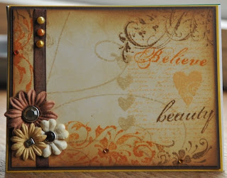
I love the way this card turned out. I made the background with Patina Glimmer Mist and Pealed Paint Distress Re-Inker and Gold Perfect Pearls mixture along with the Fleur-De-Lis Glimmer Screen from the Fanciful Screens Set. I then used the new Chalkboard Glimmer Mist in Cornflower on the heart diecut. The heart is out of white cardstock and was cut-out using my Silhouette Digital Die Cutter. I hadn't ever used this product before but I really liked it. Once that was dry I added the ribbon and the Glimmer Chips. Both of the Glimmer Chips were from the Regal set. The Fleur-De-Lis was colored using Silver Sugar and Patina Glimmer Mist and crown was colored with Gold Glimmer Mist. The gems are from My Little Yellow Bicycle.
I have two more projects but I think that I'll save those for another day. Thanks for stopping by!
I am sorry I just fell off the planet there for a little while. It has been a little crazy around here with the Holidays and general baby stuff. On top of the general craziness that seems to be my life my Hubby has been traveling a ton and working lots of long days. Having said that, I have been making a few cards and doing my other crafts. I think that I might have a craft addicition as I am currently working on at least five non-stamping projects including my first quilt.
In my last post I mentioned some projects that I wasn't able to share. Well, here they are. I had applied for a contest with Tattered Angels and since I didn't make it in, I can share these with you now. They are, naturally, Tattered Angels product heavy. :-)

On this first card I sprayed the background with Gold Glimmer Mist and let that dry. I then cut out the chandelier from QuicKutz with my Epic 6 in plain ol' cardstock. I placed that cardstock over my gold colored cardstock and spritzed with Graphite Glimmer Mist. I dried this with my heat gun and added a little Black Soot Distress Ink around the edges. The sentiment is from Fancy Pants and the frame is from Tattered Angels' Glimmer Chips Regal. To color the frame I first sprayed the whole frame with Gold Glimmer Mist and then added Viva Pink on the lower edge while the gold was still wet. The hanging "crystals" are die cuts from QuickKutz cut out of white cardstock and colored the same way as the frame. The pink ribbon is from Stampin' Up and the gems are from Hero Arts. The pink cardstock is also Stampin' Up.

I love this photo. My brother took this of our daughter asleep on my shoulder. For this project I started with a stretched canvas which I painted with Adirondack acrylic paints first in Pitch Black and once that was dry with Snow Cap and Red Pepper mixed to make pink. I don't currently have any pink so I improvised. :-) Once that dried, I distressed the edges with a saning block so the black paint would peak through. I then added a healthy amount of fine glitter. After allowing the glue to dry I sprayed the glitter with Viva Pink Glimmer Mist. I mounted my photo to a piece of cardstock that I had colored with Glimmer Mist in Black Cherry and the Fanciful Stencils Glimmer Screens. The corner pieces and the lock are Glimmer Chips from the Regal set and colored with Viva Pink Glimmer Mist and Glimmer Glam in Lipstick Pink. Although the Glimmer Chips are self adhesive I glued them down just to be sure they would stay. I then added the flowers from Prima with gem brads from My Mind's Eye. I cut out the sentiment using my Silhouette Digital Cutter. You can't really see the last step in the photo, but I added a pink ribbon around the edge of the canvas.

I love the way this card turned out. I made the background with Patina Glimmer Mist and Pealed Paint Distress Re-Inker and Gold Perfect Pearls mixture along with the Fleur-De-Lis Glimmer Screen from the Fanciful Screens Set. I then used the new Chalkboard Glimmer Mist in Cornflower on the heart diecut. The heart is out of white cardstock and was cut-out using my Silhouette Digital Die Cutter. I hadn't ever used this product before but I really liked it. Once that was dry I added the ribbon and the Glimmer Chips. Both of the Glimmer Chips were from the Regal set. The Fleur-De-Lis was colored using Silver Sugar and Patina Glimmer Mist and crown was colored with Gold Glimmer Mist. The gems are from My Little Yellow Bicycle.
I have two more projects but I think that I'll save those for another day. Thanks for stopping by!
Tuesday, October 19, 2010
Rusted Enamel Card
Hello All -
Sorry I have been MIA recently. I was working on a project that I cannot share just yet and then my horse decided to get a fairly serious injury. He is going to be okay, but it has been a lot of doctoring recently.
Today's card was created using Tim Holtz's rusted enamel technique and all of the shapes were cut using my Silhouette. Silhouette has recently upgraded the software that runs the machine. There has been a little learning curve but so far I am really liking the program. It seems a little more sophisticated and gives the user more control. I know I have said it before but I really love this machine!

My first step was to cut out two of the nested shapes (Artisans Nesting Rectangle) out of white cardstock. I inked the larger with Vintage Photo Distress Ink using my handy dandy ink blending tool.On the smaller shape I did the enamel technique using Weathered Wood and Vintage Photo Distress Ink and clear embossing powder. I then cut out two circles adding Vintage Photo Distress Ink to the larger and repeating the rusted enamel on the smaller circle. I didn't flick off as much embossing powder this time and so the circle is a little more shinny. I then took my medallion shape (Medallion Flourish) and inked on Vintage Photo. I felt like it didn't "pop" enough for me so I spritzed it with my mini mister filled with Vintage Photo re-Inker and Perfect Pearls in Copper. Just the right about of sparkle. I cut four of the large flowers and six small (3 Flowers), I removed the cut-outs out of on the small flowers. I added Antique Linen to the flowers and then shaped them into the flower shape and added My Minds Eye Lush brads. These brads rock!
For my finishing elements I added two brown organza ribbons, the smaller is from Creative Impressions and the larger ribbon was recycled from a present. I added two bronze brads to hold the ribbon in place. I assembled everything and voila! You can see a detailed photo below.


As always, thank you so much for stopping by!
Sorry I have been MIA recently. I was working on a project that I cannot share just yet and then my horse decided to get a fairly serious injury. He is going to be okay, but it has been a lot of doctoring recently.
Today's card was created using Tim Holtz's rusted enamel technique and all of the shapes were cut using my Silhouette. Silhouette has recently upgraded the software that runs the machine. There has been a little learning curve but so far I am really liking the program. It seems a little more sophisticated and gives the user more control. I know I have said it before but I really love this machine!

My first step was to cut out two of the nested shapes (Artisans Nesting Rectangle) out of white cardstock. I inked the larger with Vintage Photo Distress Ink using my handy dandy ink blending tool.On the smaller shape I did the enamel technique using Weathered Wood and Vintage Photo Distress Ink and clear embossing powder. I then cut out two circles adding Vintage Photo Distress Ink to the larger and repeating the rusted enamel on the smaller circle. I didn't flick off as much embossing powder this time and so the circle is a little more shinny. I then took my medallion shape (Medallion Flourish) and inked on Vintage Photo. I felt like it didn't "pop" enough for me so I spritzed it with my mini mister filled with Vintage Photo re-Inker and Perfect Pearls in Copper. Just the right about of sparkle. I cut four of the large flowers and six small (3 Flowers), I removed the cut-outs out of on the small flowers. I added Antique Linen to the flowers and then shaped them into the flower shape and added My Minds Eye Lush brads. These brads rock!
For my finishing elements I added two brown organza ribbons, the smaller is from Creative Impressions and the larger ribbon was recycled from a present. I added two bronze brads to hold the ribbon in place. I assembled everything and voila! You can see a detailed photo below.

Here is a photo of the whole card without the flash. 
As always, thank you so much for stopping by!
Wednesday, September 15, 2010
We're Back!!
Hello Bloggerland -
We have returned from our short vacation to Southern Colorado to visit my husband's family. We had a wonderful time and I have been working hard to get back into the swing of things. Here are a few cards for you today.


We have returned from our short vacation to Southern Colorado to visit my husband's family. We had a wonderful time and I have been working hard to get back into the swing of things. Here are a few cards for you today.


To start we have a thank you card, I know that I make a lot of thank you cards but I always needing more.
I first stamped the damask design from Heidi Swapp in Bundled Sage Distress Ink on a white piece of cardstock and then using Vintage Photos I lightly stamped french text over the card base, the stamp is Stampin' Up's En Francais. Next, using my ink blending tools I applied Bundled Sage, Mustard Seed and Wild Honey. I cut the label using the Spellbinders Label Two set. I left the die on the label and sponged it with Tea Dye Distress Ink. Next I stamped the sentiment from Waltzing Mouse Stamps Victorian Frippery in Bundled Sage. I added the two ribbons and fiber to the card mounted on a piece of Certainly Celery cardstock. I adhered the flowers from Prima, added the Hero Arts gems and attached the gem brad from My Minds Eye. Volia!

I have been watching a few YouTube videos on making flowers and here is my attempt at a layered flower. I cut out nine daisy shapes using my Silhouette machine. I made each flower about 1/4 inch smaller. I painted each flower with red watercolor paint. Once dry, I adhered the flowers together and spritzed them with Perfect Pearls in water. For the background I stamped the damask shapes from Papertry Ink's Damask Designs set using Pixie Dust chalk ink. I used a little Tea Dye Distress Ink around the edges and adhered the background to a piece of pink cardstock. I then added the peach ribbon. My last step was to add the small gem from Hero Arts.

My last card for today features the new Wanda's Pantry Stamp Set from Waltzing Mouse Stamps. I stamped the Love label image using Memento Ink. I colored it with an assortment of cool grey Copic markers (C5, C7, C9) and R27. I cut the black label using Spellbinders Label Four set. I stamped the background using an image from Papertrey's Giga Guidelines set, I used Going Grey from Stampin' Up. I then sponged over the background using Going Grey ink with a little Weathered Wood and black Soot on the edges. I then roughed up the edges and added it to a black piece of black cardstock. I added the grey organza ribbon and a little red ribbon. I love this set but just haven't had much time to use it yet.
That's it for today! Have a wonderful week.
Friday, August 20, 2010
Cards for August 20th
Hello All! I hope you had a wonderful week. I have a few cards for today. I bought a few new stamps from The Greeting Farm and I am having so much fun coloring them with my Copic markers.


Have a wonderful weekend and happy crafting!!

My first card is for my cousin in-law who is a nurse. Just a little note to say "hi." A few years a go there was a cartoon called the Animanics and one of the characters always said "Hello Nurse." So, I thought that I'd use that sentiment on this card.
Materials
Stamp: Cheeky Nurse from The Greeting Farm
Ink: Jet Black Archival Ink by Ranger (embossed with Clear Embossing Power)
Cardstock: Real Red from Stampin' Up and Solar White from Neenah Paper
DP: Autumn Leaves
Dies: Moxie from QuicKutz & Oval Nestabilities from Spellbinders
Flowers: Prima
Gems: Hero Arts
Brads: My Mind's Eye Lush Collection & Creative Impressions
Glitter: Stickles in Xmas Red

Next we have Tuesday from the Creeper Crew by The Greeting Farm. I love her attitude!
Materials
Stamps: CC Tuesday by the Greeting Farm, Giga Guidelines from Papertrey Ink & My Sentiment's Exactly
Ink: Tuxedo Black Memento Ink, Victorian Velvet & Tumbled Glass Distress Ink from Ranger/Tim Holtz
Markers: Assorted Copic Markers
Paper: Solar White from Neenah Paper & Light Blue paper from The Paper Co
Dies: Labels Two Nestabilities from Spellbinders
Ribbon & Brads: Creative Impressions
Heart Eyelet: Queen & Co
Glitter: Stickles in Yellow
And now for a bit of a gear change. :-)

This card features the Medallion stamp from Stampin' Up. I love this stamp I find that very versatile! I broke out the real glitter, versus Stickles for this card. As a result I am finding little pieces of glitter all over the house. I have actually picked a few pieces off the baby. I use the Art Institute Art Glitter Designer Adhesive when I work with glitter along with the Ultrafine Metal Tip. I feel like this gives me the most control over the glue and I feel like the adhesive really holds the glitter in place. I will say that I do clean the metal tip after each use by soaking it in soapy water and then making sure that all of the adhesive is out of it with a small pin. It can be a bit of a hassle but then I don't have to struggle with picking dried glue out of the tip later.
Materials
Stamp: Medallion from Stampin' Up
Paper: Neenah Paper, The Paper Co
Ink: Versamark Ink & Weathered Wood Distress Ink
Embossing Powder: Black from Stampin' Up
Marker: Copics
Glitter: Real Red from Stampin' Up
Adhesive: Art Institute Designer Adhesive
Tool: Ink Blending Tool

My last card for the day is something I made for another card maker and I hope that she enjoyed getting it. I really find myself reaching for my Distress Inks a lot, they just work great for this type of look.
A quick tip: When I use Distress Inks with clear stamps I usually load the stamp with Versamark Ink first. I find that this minimizes the ink beading that can sometimes happen with clear stamps.
Materials
Stamps: From the Garden by Fancy Pants & Giga Guidelines from Papertrey Ink
Ink: Dried Marigold, Spiced Marmalade, Tattered Rose & Wild Honey Distress Inks & Versamark Ink
Paper: Solar White from Neenah Paper & Stampin' Up
Die: Labels Four from Spellbinders
Gems & Pearls: Hero Arts
Glitter: Stickles in Yellow & Orange

Have a wonderful weekend and happy crafting!!
Wednesday, July 28, 2010
Cheeky Rockabilly

I love the Cheeky Cherry stamps from The Greeting Farm! I thought that I would try a challenge from the Color Me Copic blog. The challenge was to color using black and white. I went with the warm tone grey copics. The circle stamp is Butterfly from Inkadinkado and was stamped using Pumice Stone Distress Inks. I then stamped the long image which is from Technique Tuesday and is called Bijou Borders, also stamped in Pumice Stone. I sponged the background and stamped the sentiment from Fancy Pants. The gems are from Basic Grey and are grey and clear. I really enjoyed this challenge!

Here is an easle card I made with th Cheeky Rockabilly again using my Copic markers. These are so much fun! The ribbon is from Creative Impressions and the flowers are from Prima. The gems are from Hero Arts and the glitter paper is from Archiver's.

Thanks for stopping by!
Thursday, July 22, 2010
Cards for July 22nd
Little Charlotte is taking a nap so I am really hoping to get this post done before she wakes up. The joys of crafting with a three month old. :-)

All of the images on this card are from the Fancy Pants Bella Brush set. I used Antique Linen, Dried Marigold, Spiced Marmalade and Vintage Photo Distress Inks. My card base started as a piece of white cardstock and I just kept adding ink and stamped images. The ribbon is from Creative Impressions, flowers are from Prima and the gems and pearls are from Hero Arts, the brads in the center of the flowers are from My Minds Eye.
Thank you for stopping by!

So my first card for today features the awesome Cheeky Rockabilly from The Greeting Farm. I colored her with my Copic markers added Hero Arts gems and layered her to two cardstock ovals, that I cut with my Spellbinders dies. I aged the DP with Tea Dye and Vintage Photo Distress Inks and mounted those pieces to Glorious Green CS from Stampin' Up. The edge punch is from EK Sucess. The sentiment is from Stampin' Up's Warmest Regards set. I think that she turned out pretty cute!

All of the images on this card are from the Fancy Pants Bella Brush set. I used Antique Linen, Dried Marigold, Spiced Marmalade and Vintage Photo Distress Inks. My card base started as a piece of white cardstock and I just kept adding ink and stamped images. The ribbon is from Creative Impressions, flowers are from Prima and the gems and pearls are from Hero Arts, the brads in the center of the flowers are from My Minds Eye.
Thank you for stopping by!
Subscribe to:
Posts (Atom)